
Hello readers!
Welcome to part 4 of HTML5 build series! In this part we will fix an issue we currently have with our game. Our game is not responsive. This means our game is currently always rendered at width of 800 pixels and height of 600 pixels. This is a problem for people with small screens and for mobile phone/tablet users!
Because HTML5 supports multiple platforms it can be quite essential to make our canvas responsive!
Lets take a look at our problem.
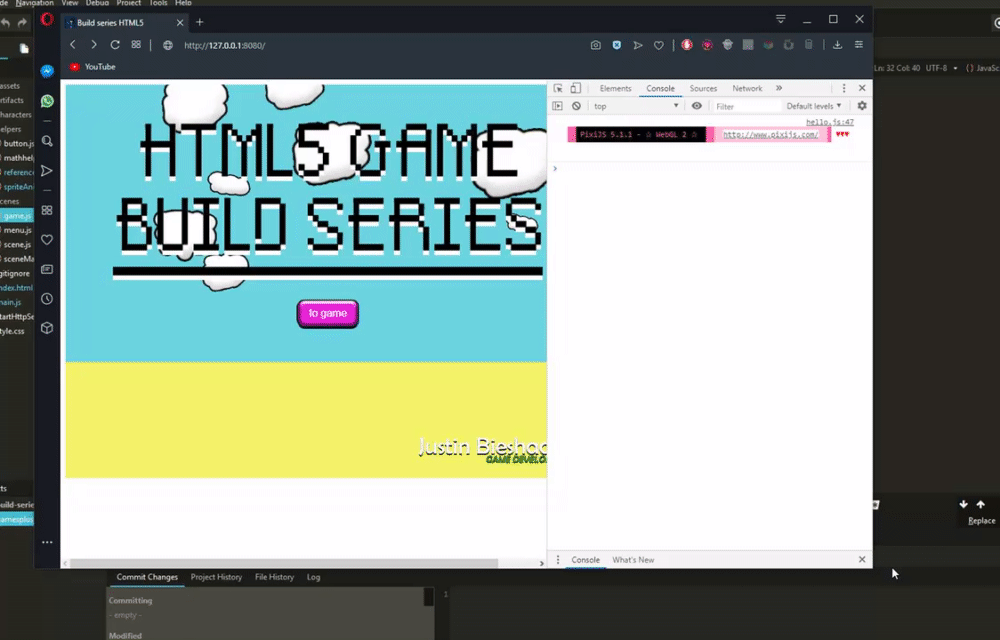
As we can see when we resize our website window the game will be running outside the window. This is a problem because a lot of our elements will be unreachable and makes the game practically impossible to play.
Lets start
To start we first need to know to which new width and which new height we have to scale our canvas to. Luckily javascript can provide us the information of our current window width and height, also called inner width/height.
Using this information we can get a scale factor of our frame.
This will look like this:
const width = 800;
const height = 600;

const scaleFactor = Math.min(window.innerWidth / width, window.innerHeight / height);
var newWidth = width * scaleFactor;
var newHeight = height * scaleFactor;
I am using Math.min to get the minimum value from width or height scale. This means when you scale your window from bottom/top and when it is smaller than the width it will scale using the screen difference from height. When width is smaller than the height of your window it will scale using the screen difference from width.
Because a user can resize their window at any time. We have to create a function and assign it to the resize event of JavaScript. The resize will call this function every time if a window is resized.
Our method will look like this:
var resize = () => {
    const scaleFactor = Math.min(
        window.innerWidth / width,
        window.innerHeight / height
    );
    var newWidth = width * scaleFactor;
    var newHeight = height * scaleFactor;

    console.log("scale factor: " + scaleFactor + " new width: " + newWidth + " new height: " + newHeight);
};

window.addEventListener('resize', resize, false);
We now created a function using lambda expression () => {} and assigned this to the ‘resize’ event from our JavaScript window.
I added the comment to see if it is actually working.
As you now can see, the scale factor seems to be correct!
Now lets apply this scale factor to our actual canvas. Add this snippet at the bottom of our main.js.
//main.js

var resize = () => {
    const scaleFactor = Math.min(
        window.innerWidth / width,
        window.innerHeight / height
    );
    var newWidth = width * scaleFactor;
    var newHeight = height * scaleFactor;

    renderer.view.style.width = newWidth + 'px'; // applying new width to our renderer view
    renderer.view.style.height = newHeight + 'px'; // applying new height to our renderer view
    console.log("scale factor: " + scaleFactor + " new width: " + newWidth + " new height: " + newHeight);
};

window.addEventListener('resize', resize, false);
resize(); // make sure it resizes from the start
I applied the new width and height to the renderer view. The view is a HTMLCanvasElement the documentation (https://developer.mozilla.org/en-US/docs/Web/API/HTMLCanvasElement) describes width and height as ”
attribute of the <canvas> element interpreted in CSS pixels”. Because it is interpreted as CSS pixels we had to add ‘px’ after the scale calculation to let the variable understand what it has to change to. 😛
Lets test if this worked.

As we can see, it works! 😀
I only have one problem with this. I personally do not like it to go beyond its default size 800×600. To fix this we should clamp the scale factor so it can not go beyond 1.
Sadly JavaScript does not have Math.clamp yet to the date I am writing this. So lets create our own! 🙂
We will create a new class for this even though it is a small feature. We will maybe extend it in the future.
Class looks like this:
// helpers/mathhelper.js
export default class MathHelper {
    static clamp(num, min, max){
        return num <= min ? min : num >= max ? max : num;
    }
}
It is a really small class but as I said we might have to extend it in the future.
This class will be used for static methods to return an outcome. In this case it will check if the number has reached the minimum or maximum number we want it to be. If it is lower than our minimum it will return min, if it is higher than our maximum it will return max. If it is in between our minimum or maximum it will return num.
Now we only have to implement this new method to our scale factor in the resize function and the canvas will be clamped.
Code:
//main.js
...

import MathHelper from './helpers/mathhelper.js';

...

var resize = () => {
    // clamping scaleFactor
    const scaleFactor = MathHelper.clamp(Math.min(window.innerWidth / width, window.innerHeight / height), 0, 1);
    var newWidth = width * scaleFactor;
    var newHeight = height * scaleFactor;

    renderer.view.style.width = newWidth + 'px';
    renderer.view.style.height = newHeight + 'px';
};

window.addEventListener('resize', resize, false);
resize();
Result:
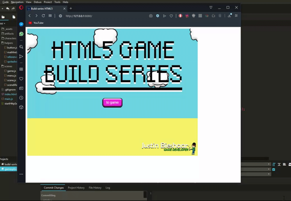
Now our game will be responsive and playable on all platforms.
That is it for this episode!
In case you couldn’t follow something and really want to see the full script feel free to check my github repository for this episode: https://github.com/jscotty/html5_buildserie/tree/EP3_SpritesheetsAnimations
You can also find other parts in this repository by simply checking the branches tab.
hope you’ve enjoyed this episode! If you have any questions, feel free to ask in the comments!
Greetings,
-Justin Scott
Leave a Reply